Pantone goes true blue with 2020 Color of the Year
Classic Blue evokes wellness, dependability, expanded thinking.
What does the color blue mean to you?
Maybe you think of the sky, or the ocean, or a nearby lake. Perhaps it evokes feelings of sadness, or maybe it offers peace, tranquility and contemplation.
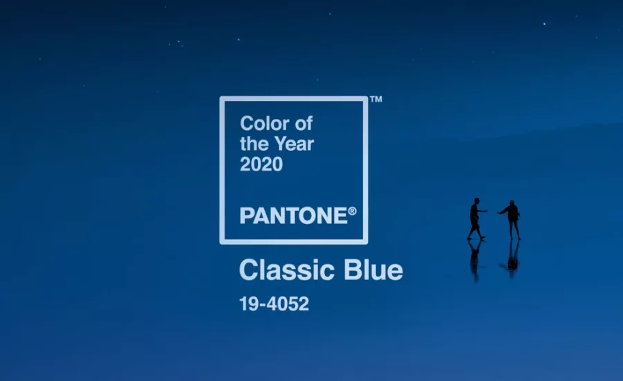
For Pantone the color blue represents all these things and more. The provider of professional color language standards named Classic Blue, specifically PANTONE 19-4052, as the 2020 Color of the Year.
It follows the 2019 Color of the Year, PANTONE 16-1546 Living Coral, a lively pink-orange shade, and the 2018 Color of the Year, PANTONE 18-3838 Ultra Violet, a dramatic, blue-based purple.
“We are living in a time that requires trust and faith. It is this kind of constancy and confidence that is expressed by PANTONE 19-4052 Classic Blue, a solid and dependable blue hue we can always rely on,” said Leatrice Eiseman, executive director of the Pantone Color Institute. “Imbued with a deep resonance, PANTONE 19-4052 Classic Blue provides an anchoring foundation. A boundless blue evocative of the vast and infinite evening sky, PANTONE 19-4052 Classic Blue encourages us to look beyond the obvious to expand our thinking; challenging us to think more deeply, increase our perspective and open the flow of communication.”
While Pantone is closely connected to fashion, interior design and graphic design, the color identification system can also apply to food and food packaging.
In fact, Pantone has already offered a few thoughts on how Classic Blue can relate to those categories:
Classic Blue in Food and Beverage
Blue foods and beverages including PANTONE 19-4052 Classic Blue-like shades are rich in anthocyanins. With this relationship to wellness and self-care these blue foods help to build a solid foundation, acting as a form of protection for good health. In addition to their natural health benefits, these blue foods also bring style and sophistication to the table.
Classic Blue in Graphic Design and Packaging
Because of PANTONE 19-4052 Classic Blue’s relation to the sky at dusk, something we see every day, it maintains a perception of dependability and constancy. A color we respond to viscerally as being trustworthy, PANTONE 19-4052 Classic Blue is an ideal shade for many applications of graphic design. This is especially true for packaging where PANTONE 19-4052 Classic Blue conveys the message of honesty, credibility and reliability that today’s consumers are connecting to.
This is something to think about as food manufacturers develop new products and their packaging in 2020, especially if they want to convey messages of wellness, trustworthiness and stability.
Of course, a firm whose focus is on color wouldn’t make such an announcement without a splash. Partnering with Adobe, Artechouse, Audio UX, FedEx and others, Pantone developed a multisensory experience envisioning how Classic Blue could be translated through taste, scent, sound and touch.
Pantone and Adobe collaborated on stock images featuring Classic Blue, while the firm and Audio UX developed “Vivid Nostalgia,” a sound clip inspired by the color that utilizes traditional instruments in innovative ways.
Pantone also worked with fragrance and flavor house Firmenich to create the essence of “taste” and “smell” of Classic Blue. In a press release, Pantone said the color “holds the experiential smell of fresh green, the initial taste of fruity sweet berry, and the final finish of floral and Classic Blue notes. The smell of Classic Blue is a fragrant contemplation of where sky and sea meet – a boundless blue where there is no end.”
While Pantone hosted an announcement event at Artechouse featuring these elements, the firm also boxed up the experience and sent it to bloggers, influencers and media, including Candy Industry.
I always get a kick out of seeing which hue Pantone chooses for the Color of the Year, but this year, it was especially fun to see the many ways in which Classic Blue can be interpreted.
Hopefully your 2020 is a year full of peace, wellness and blue-sky thinking.
