A 'Smarter' Look For Dum Dums
New graphics give lollipop first makeover in more than 10 years
|
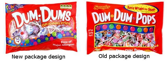
For the first time in more than a decade, Dum Dums will sport a “smarter” look.
Spangler Candy Co. is introducing a new, more modern packaging design and logo for the lollipop product line, which is scheduled to debut in mid-2012.
The new logo has a brighter and bolder appearance on the pack, and the word “Pops” was removed from the logo and placed in the package’s descriptor roll.
The new packaging also includes front-of-pack nutrition and allergen-free labeling, as well as a list of usage occasions on the back of the pack.
Although the company is launching a modern look for their Dum Dums product, they also note the importance of not straying too far from the brand’s heritage.
“It is important to stay current with our graphics but retain the Dum Dums look,” says Jim Knight, vice president of marketing at the Spangler Candy Co.
Spangler Candy Co. brought in Fisher Design, a Cincinnati-based brand design agency to work alongside their marketing department to develop the new Dum Dums packaging. The multi-phase process incorporated input from sales, production, and quality assurance.
The Spangler Candy Co. has been in business since 1906 and their line of products includes Dum Dums, Saf-T-Pops, Circus Peanuts and Marshmallow Treats, Spangler Candy Canes, and Valentine, Easter, Halloween, and Christmas Candies.
Looking for a reprint of this article?
From high-res PDFs to custom plaques, order your copy today!


