King's Hawaiian unveils new logo, packaging
The brand is rolling out the refreshed packaging for its 75th anniversary.
Courtesy of King's Hawaiian
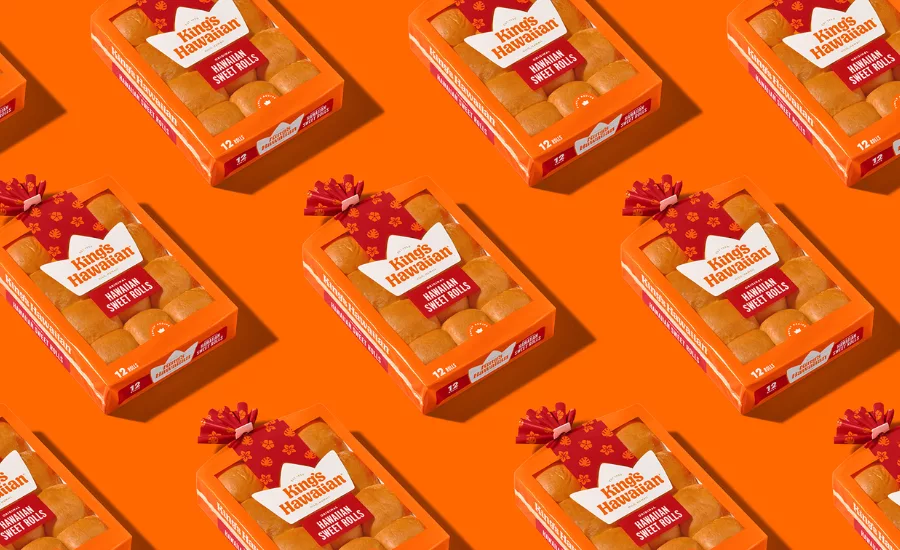
King's Hawaiian, maker of dinner rolls, is celebrating the company's 75th anniversary by unveiling a new look that is rolling out across digital and social channels, along with new packaging that will be introduced at retail in early July.
As it prepares for a new generation of fans, the brand is launching a reimagined visual identity by creative agency Mrs&Mr that celebrates its cultural roots while embracing the future.
The company has been bringing people together since 1950 when Robert Taira opened his first bakery in Hilo, Hawaii. Still family-owned and operated to this day, King's Hawaiian continues to use the same recipe for its signature sweet rolls and company success that was first established more than seven decades ago, it says. The new identity purports to reinforce the brand’s joyous ethos while leaning into more current design sensibilities and paying homage to its Hawaiian origins.
“We reimagined the King’s Hawaiian brand to honor our rich heritage while infusing and modernizing it with vibrant energy. The new identity reflects a thoughtful evolution—crafted through deep creative partnership with Mrs&Mr to ensure every detail felt authentic, and forward-looking,” says Liz Bondor, head of creative, King’s Hawaiian.
Inspired by the signature roundness of King’s Hawaiian’s original rolls, the brand’s crown was redrawn by hand. Its once-sharp edges have been softened, and its forms puffed and plumped to evoke the warmth and freshness of oven-baked rolls—a homage to the product that started it all, the brand says.
The wordmark, long set in a traditional all-uppercase serif, has undergone a complete transformation. Now rendered in custom, lowercase lettering, it aims to introduce a friendlier, more approachable personality. The typography captures the brand’s joyful spirit and mirrors the soft, pillowy texture of the rolls themselves, King's Hawaiian notes.
While King’s Hawaiian is instantly recognized by its signature orange, the rebrand introduces a fresher, more vibrant take on the orange color. This lively new orange is paired with complementary hues of red, yellow, gold, and cream.
The refreshed packaging features custom illustrations inspired by traditional Hawaiian flora—hibiscus, monstera, and plumeria. Mrs&Mr also introduced a ribbon-like motif that wraps every package,. To deepen the brand’s storytelling, a stamp system was created, showcasing spirited, bakery-inspired messages that nod to King’s Hawaiian’s origins and aims to add a warm, personal touch.
Infused with the refreshed color palette, King’s Hawaiian’s updated imagery includes high-contrast lifestyle and product photography, paired with bright, directional lighting.
“This iconic brand called for a thoughtful, intentional design. Crafted to capture King’s Hawaiian’s social and irresistible appeal, every detail of the redesign was carefully considered to connect with both longtime loyalists, and first-time fans alike,” adds Kate Wadia, founder and CCO, Mrs&Mr.
Related: King's Hawaiian announces passing of Chef Eric Koyama
Looking for a reprint of this article?
From high-res PDFs to custom plaques, order your copy today!