Blue Diamond unveils new look
The brand refresh highlights almonds as a superfood with a vibrant new identity.
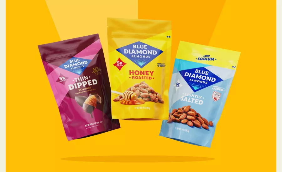
Courtesy of Blue Diamond
Blue Diamond Almonds has introduced a new logo and brand identity designed to reflect consumer preferences and highlight almonds as a nutrient-dense food. The updated visual system includes a streamlined color palette and revised brand elements intended to improve visibility across packaging, signage, and digital platforms.
Following research with more than 7,000 consumers, Blue Diamond collaborated with design agency Turner Duckworth to develop a refreshed brand system. The redesign incorporates bold colors, simplified typography, and a modernized version of the brand’s diamond shape.
Blue Diamond, founded in 1910, represents a cooperative of more than 3,000 almond growers in CA. The brand’s previous identity was last updated in 2004.
“We believe that Blue Diamond Almonds are the G.O.A.T. of snacks, and our Almond Breeze is the obvious choice in non-dairy beverages. Almonds allow you to show up and be mighty in your life, fueled by protein, fiber, and flavor. This refresh connects this almond identity to the brand identity, breathing color, energy, and excitement into the brand,” says Maya Erwin, vice president of marketing and innovation at Blue Diamond.
“This is a refresh, not a revolution. That means we're staying true to our roots, keeping our identity that people know and trust, but with a bold edge that shows the way people enjoy our amazing products every day,” Erwin says.
“A redesign like this is really about getting two things right,” says Miles Marshall, executive creative director at Turner Duckworth. “First, the edit—chipping away at the elements until what's left are the features that can only be the brand—the truly unmistakable stuff. In this instance that edit gets us to the iconic blue diamond, which we have redesigned in a way that is both respectful and striking. If you contrast it to what went before, it has so much more confidence.”
Marshall adds, “The second thing to get right is narrative. That's where the creative work takes off. For Blue Diamond, it's the idea that the brand is a champion of the almond, the supernut, which is a powerful idea that shapes and supercharges everything: graphics, language, colors—every aspect of the brand's universe.”
Key features of the brand refresh include:
Key features of the brand refresh include:
- A revised logo that retains the diamond shape and color, with updated typography and layout for improved clarity.
- A new design system featuring bold colorways, confident typesetting, and consistent language across media.
- An expanded asset palette designed to support flexible creative execution and enhance visual impact.
The rollout will begin with Snack Almond products and expand to other lines starting this fall, including Nut-Thins and Almond Breeze. Timing will vary by category.
Looking for a reprint of this article?
From high-res PDFs to custom plaques, order your copy today!


